Project Type: Magazine Design, Editorial Layout, Typography
Tools: Adobe InDesign, Adobe Photoshop, Adobe Illustrator
Tools: Adobe InDesign, Adobe Photoshop, Adobe Illustrator
Background: This project began as Bay Area Trail, a class assignment focused on local hikes. The feature issue spotlighted a Mount Tamalpais foothill trail, built around a collection of original photography. I later expanded the concept into Trail and Thrive, merging hiking with forest bathing to create a mindful outdoor magazine. Designed for all experience levels, it encourages intentional exploration and deeper connection to nature. The subhead, “Step outside, breathe in, breathe again,” captures the spirit of the publication.
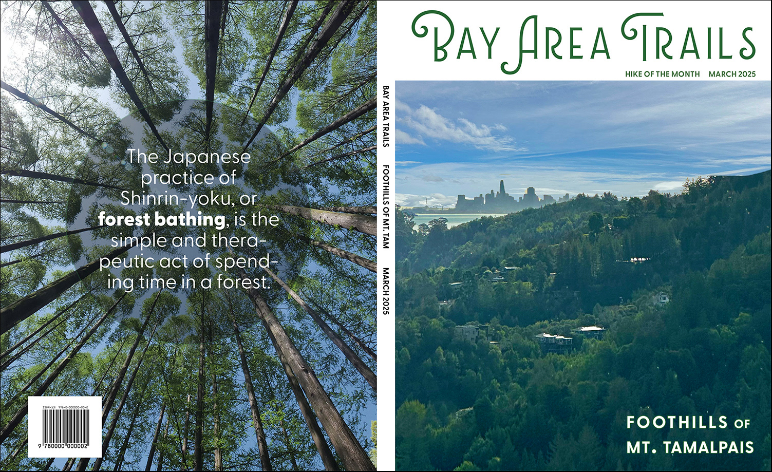
Bay Area Trails Magazine Front and Back Cover
Concept: Trail and Thrive is designed for hiking enthusiasts and health-conscious adults seeking both adventure and restoration. The concept unites the physicality of the trail with the mindfulness of forest bathing. A leaf symbol anchors the visual identity, representing nature, balance, and growth, and supports the magazine’s goal of encouraging intentional, present exploration.
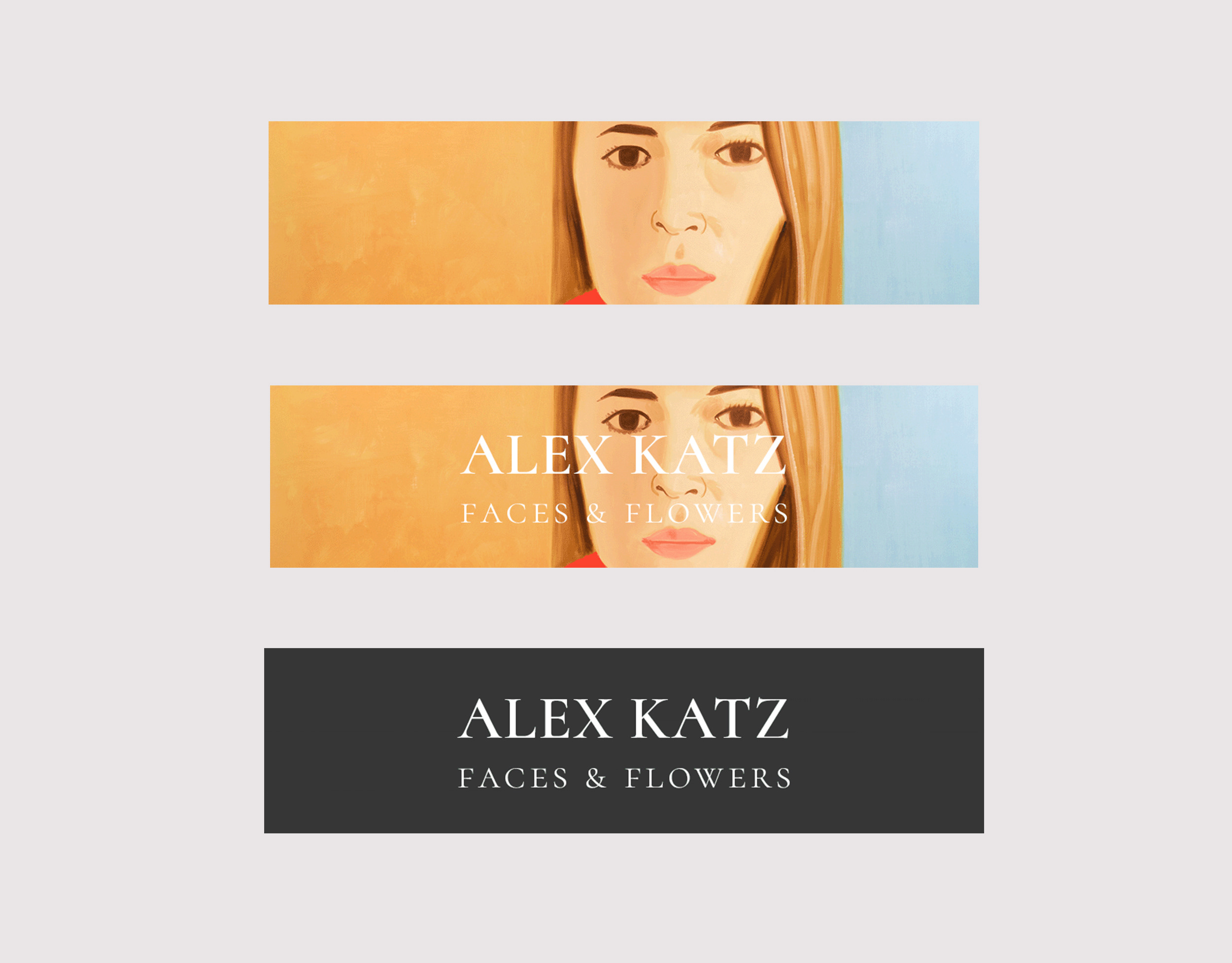
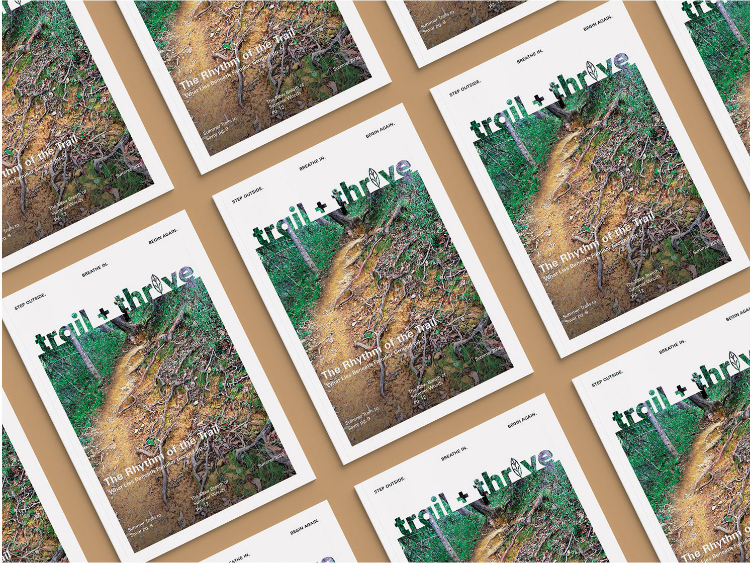
Trail + Thrive Magazine system
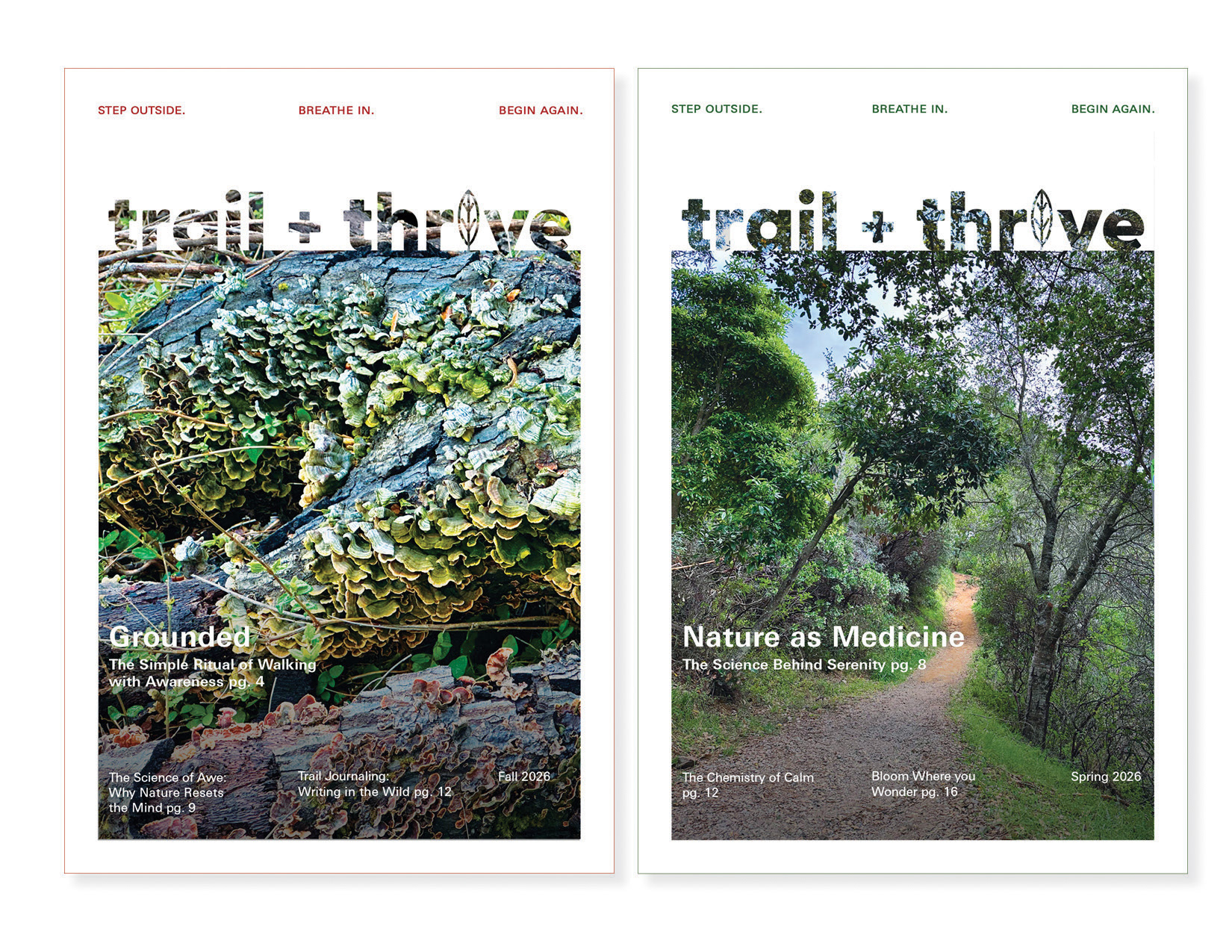
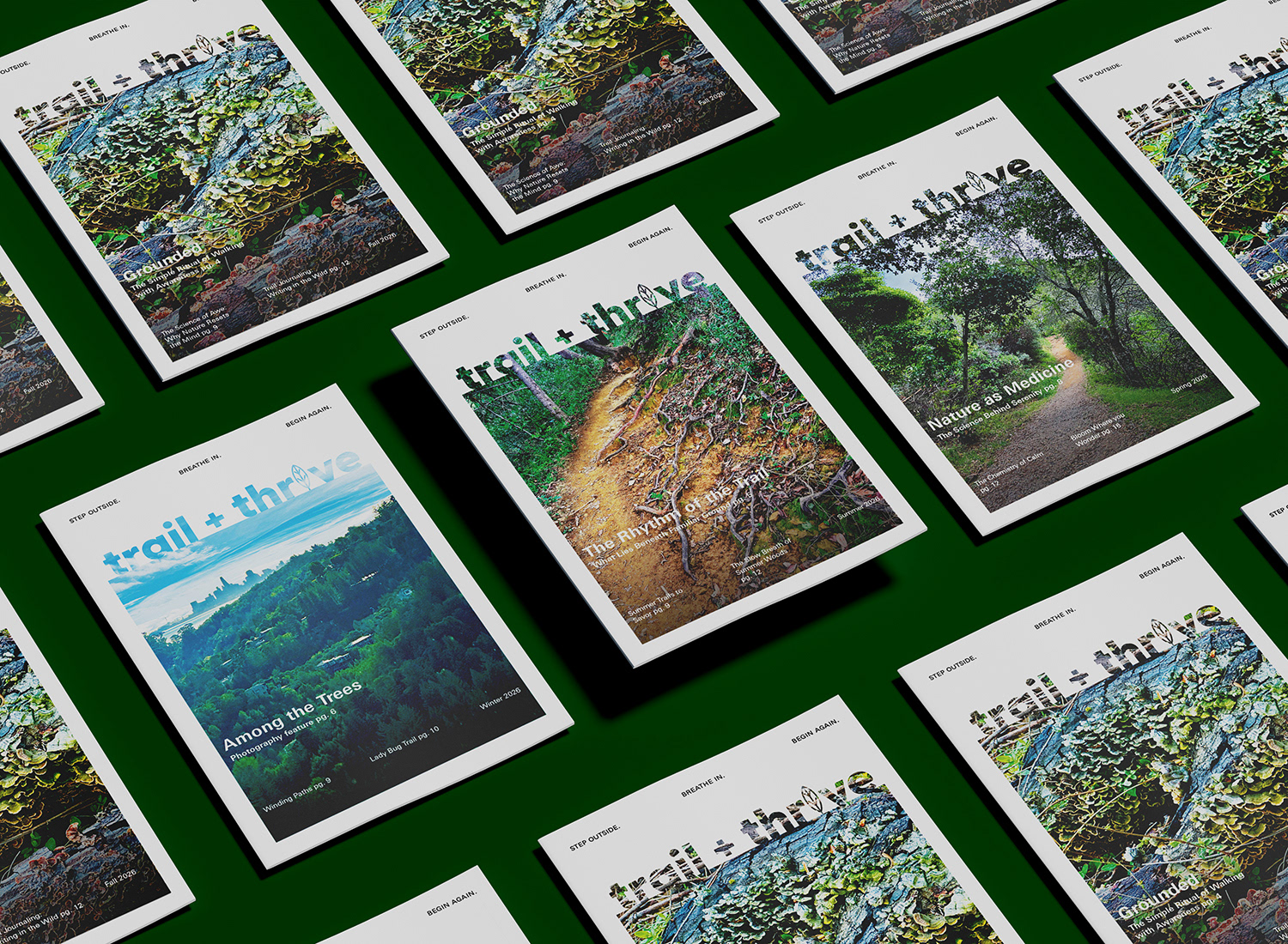
Trail + Thrive Magazine Fall and Spring Covers
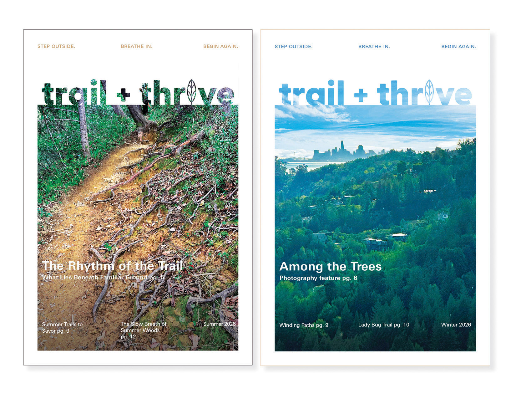
Trail + Thrive Magazine Fall and Spring Covers
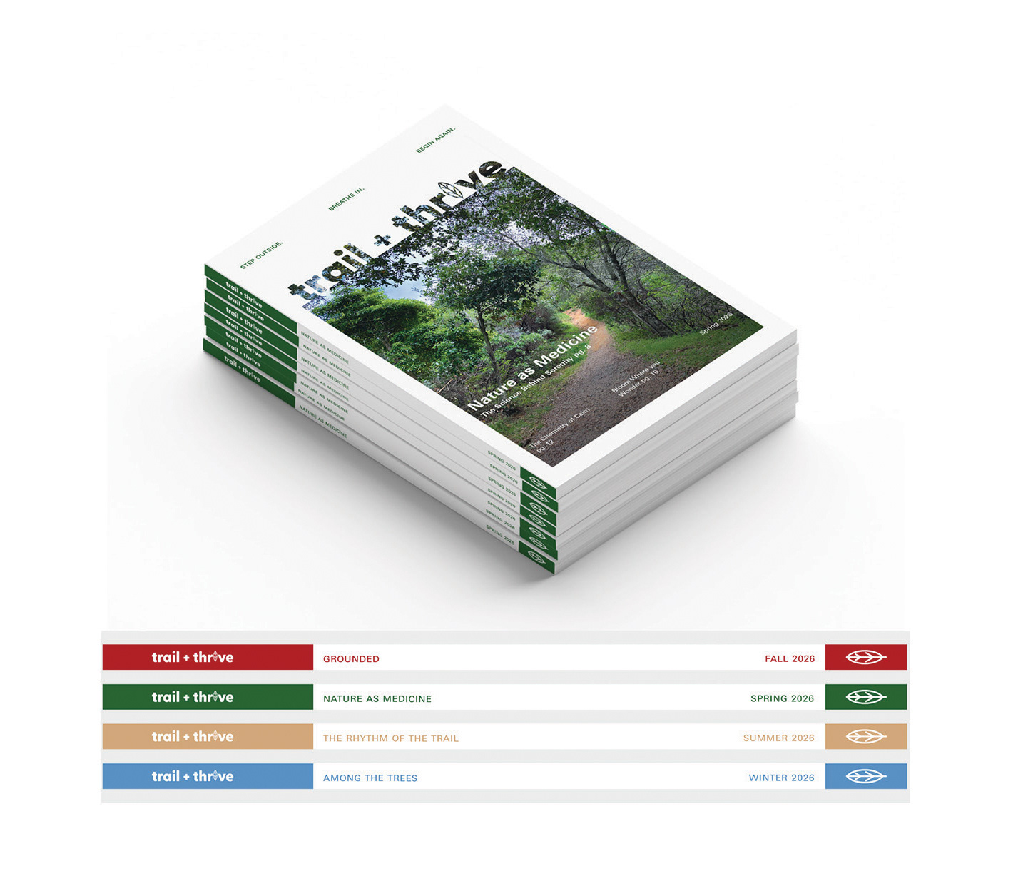
Trail + Thrive Magazine spine system
Design Process: The masthead was developed to balance energy and serenity, evolving from early explorations of trail markers and organic forms into a illustrated leaf symbol. This became the foundation of a flexible identity system. A seasonal color palette was created to reflect year-round exploration, with the leaf symbol shifting color across spring, summer, fall, and winter covers to maintain consistency while introducing variation. Typography and layout were chosen to support both trail-focused content and contemplative features. GreyCliff CF’s organic character pairs with a flexible grid system that balances white space and immersive imagery. Original Mount Tamalpais photography grounds the magazine in authentic outdoor experience.

Mastehead iterations

Color palette
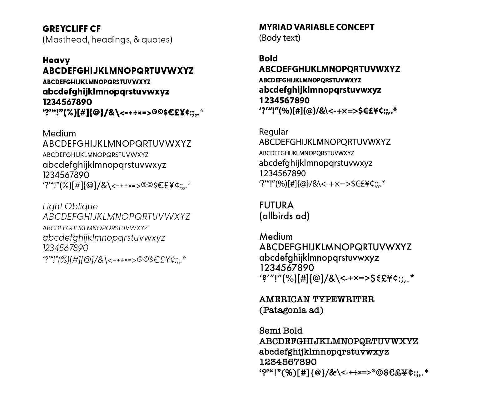
Typography
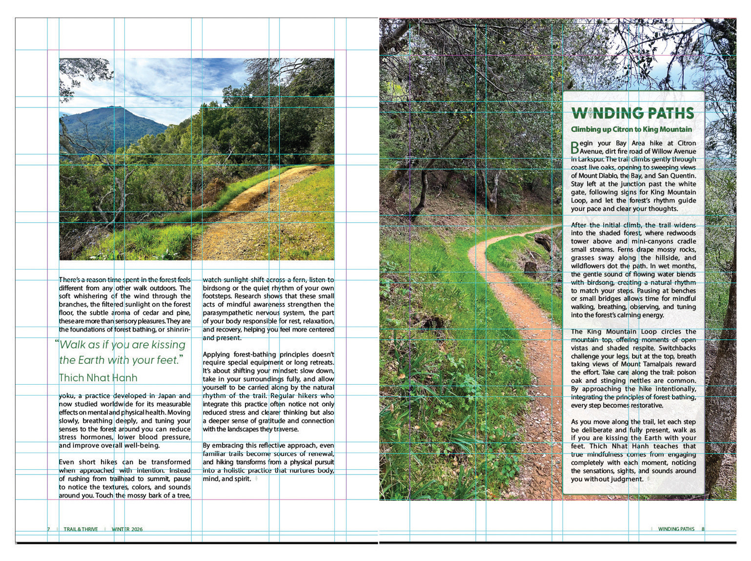
Grid and Layout
Design Solution: The final solution is a cohesive editorial system that reflects both the physical and meditative dimensions of outdoor experience. A custom illustrated leaf symbol anchors the identity, designed with simple, geometric proportions that feel precise and typographic, while remaining immediately recognizable as organic. It represents nature, growth, and renewal, and is supported by a seasonal color system that allows each issue to shift across spring, summer, fall, and winter without losing brand recognition.
GreyCliff CF typography and a flexible layout system support a wide range of content—from energetic trail features to quieter, reflective moments. Original photography grounds the magazine in authentic experience, reinforcing the connection between exploration and mindfulness. The subhead, “Step outside, breathe in, breathe again,” encapsulates the magazine’s purpose and emotional tone.
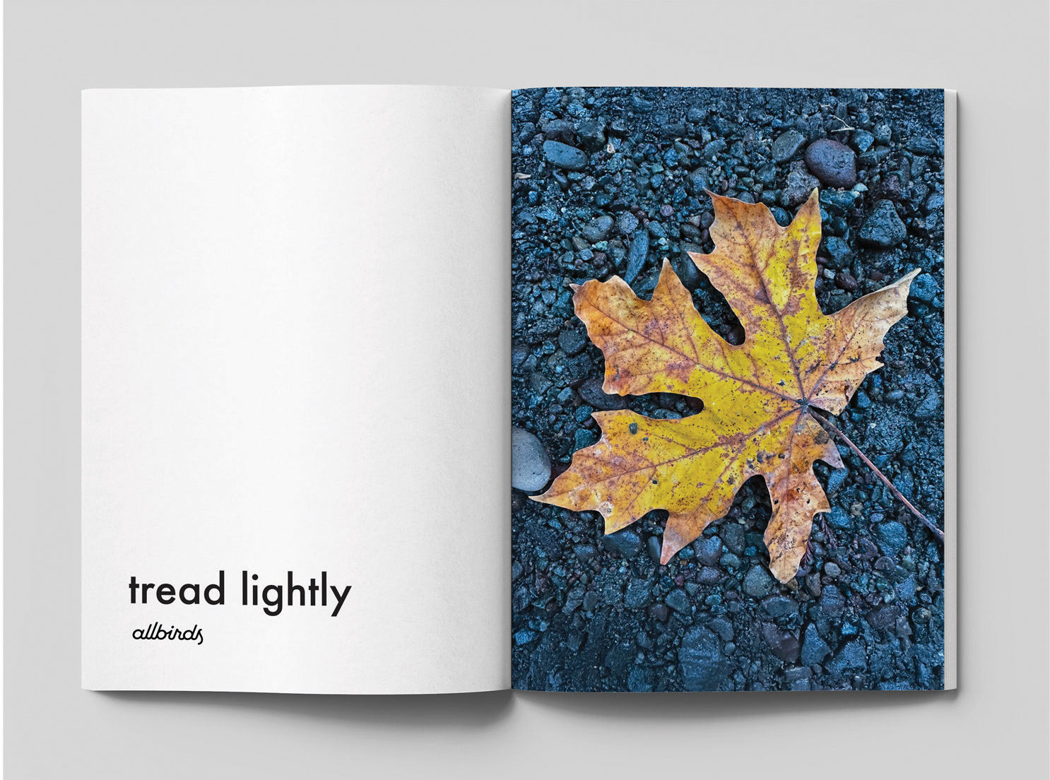
To further extend the realism of the publication, I designed integrated advertisements for Patagonia and Allbirds, placed on the back cover and within an interior spread. Both brands were selected for their alignment with the magazine’s audience and values, and the ads were art-directed using the same photographic language to ensure they felt native to the editorial environment.
GreyCliff CF typography and a flexible layout system support a wide range of content—from energetic trail features to quieter, reflective moments. Original photography grounds the magazine in authentic experience, reinforcing the connection between exploration and mindfulness. The subhead, “Step outside, breathe in, breathe again,” encapsulates the magazine’s purpose and emotional tone.
To further extend the realism of the publication, I designed integrated advertisements for Patagonia and Allbirds, placed on the back cover and within an interior spread. Both brands were selected for their alignment with the magazine’s audience and values, and the ads were art-directed using the same photographic language to ensure they felt native to the editorial environment.
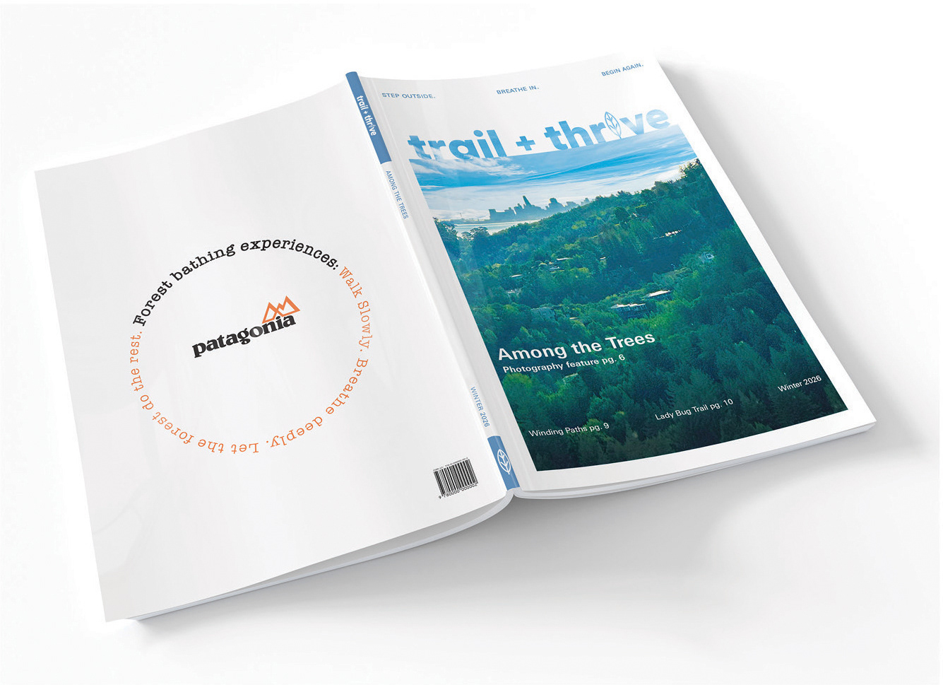
Trail + Thrive Magazine Winter cover, spine and Patagonia ad on back Mock up
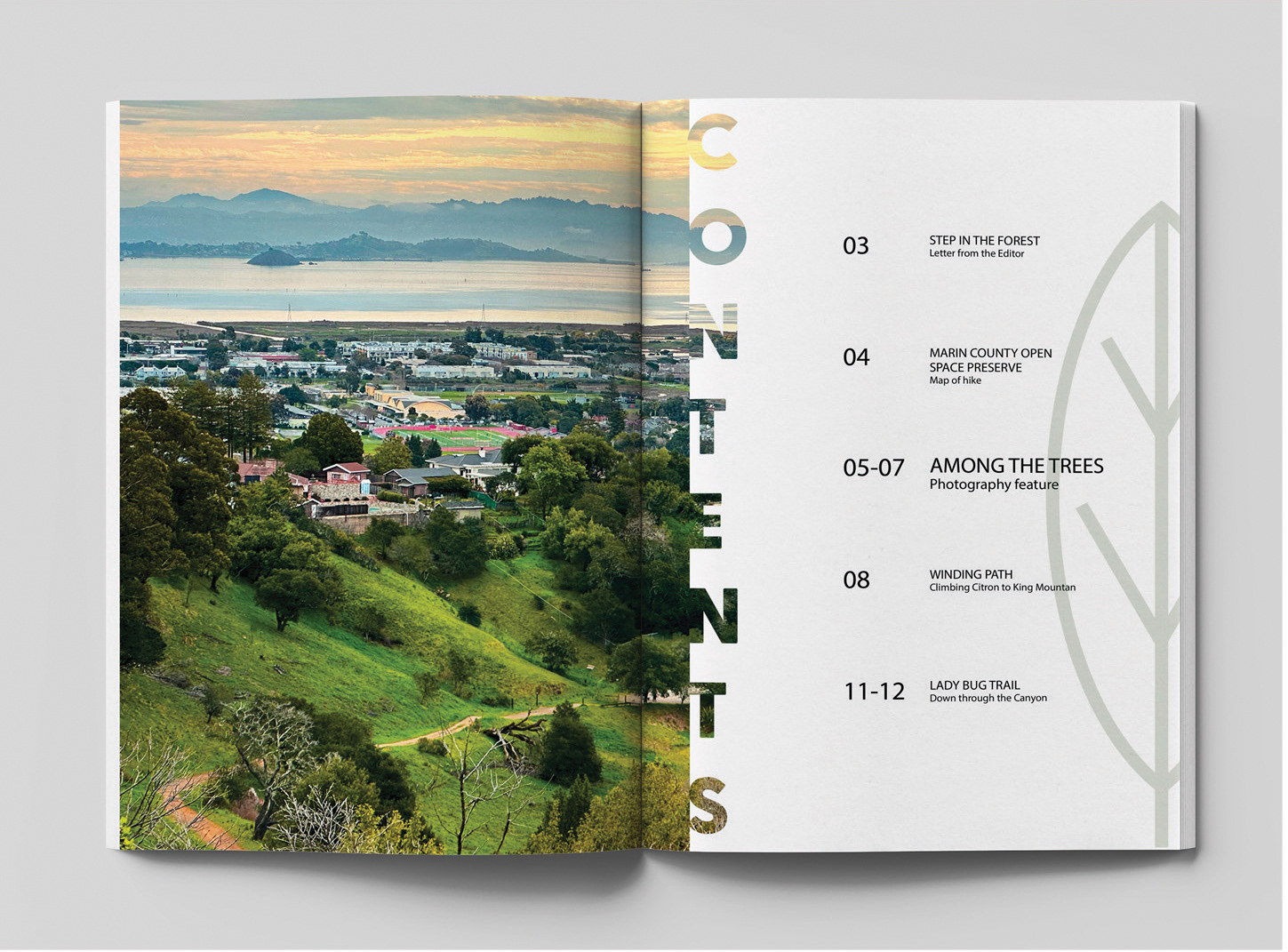
Trail + Thrive Magazine Winter Table of Contents Mock up
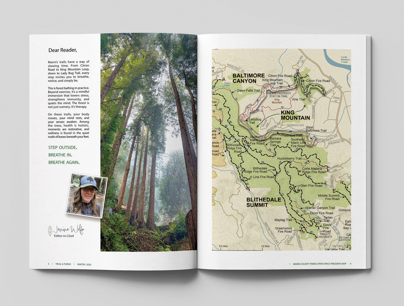
Trail + Thrive Magazine Winter letter to editor Mock up
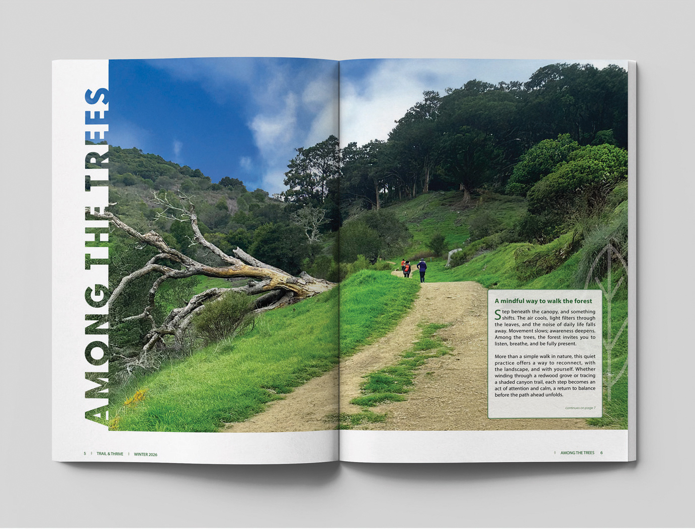
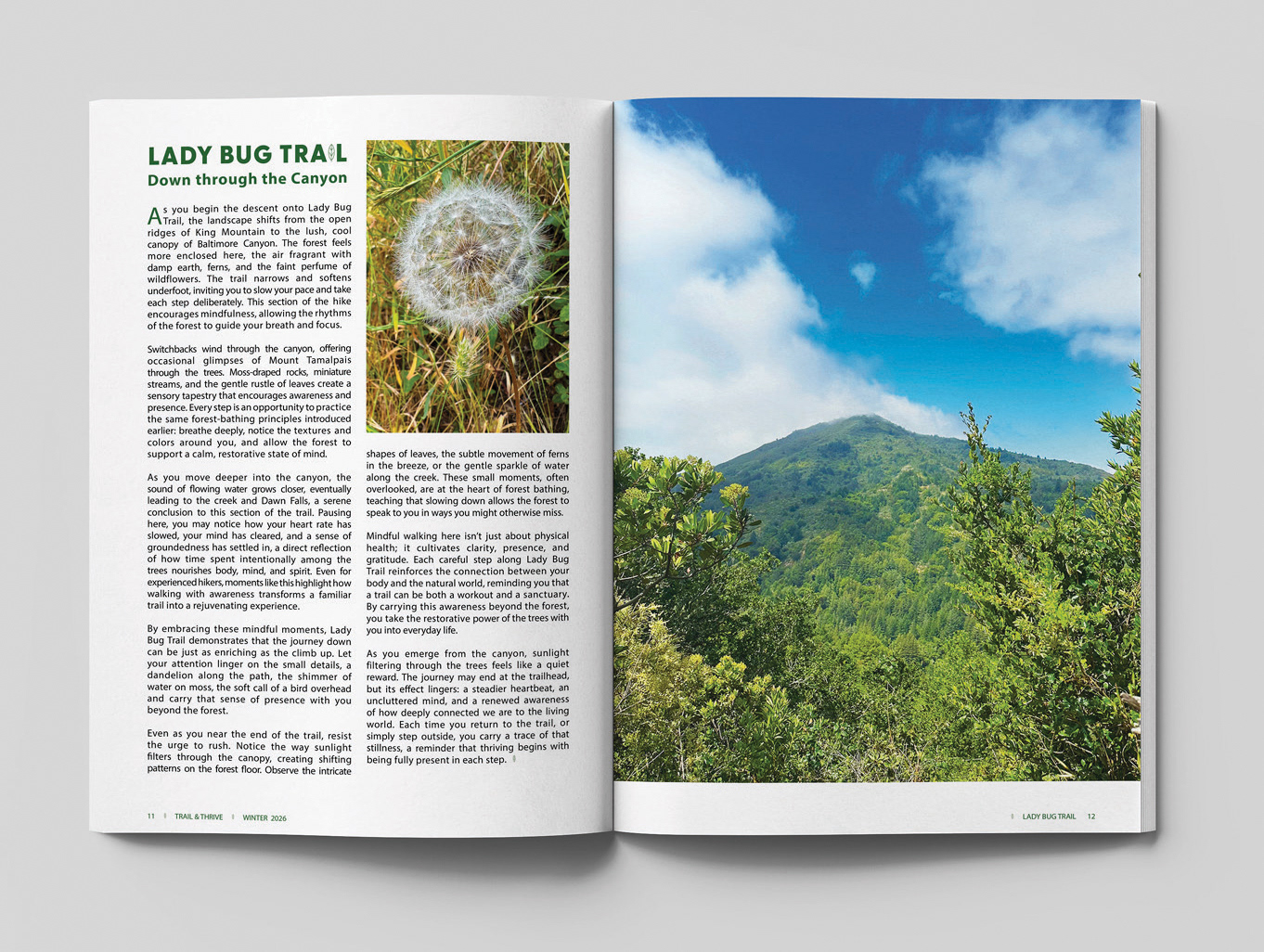
Trail + Thrive Magazine Winter feature article Mock up

Trail + Thrive Magazine Winter interior spread Mock up
Trail + Thrive Magazine Winter interior spread allbirds ad Mock up
Trail + Thrive Magazine Winter interior spread Mock up
Impact & Learning: This project strengthened my editorial design and system-building skills, particularly in building identities that can evolve while remaining consistent. I learned how precise symbolic forms can communicate meaning while staying visually flexible, and how seasonal systems can introduce variety without fragmenting a brand.
Developing original photography and brand-aligned advertising reinforced the importance of authenticity and cohesion. Most importantly, this project deepened my understanding of how thoughtful editorial design can shape experience—bridging active exploration with mindful connection to create a publication that feels both grounded and restorative.
Developing original photography and brand-aligned advertising reinforced the importance of authenticity and cohesion. Most importantly, this project deepened my understanding of how thoughtful editorial design can shape experience—bridging active exploration with mindful connection to create a publication that feels both grounded and restorative.