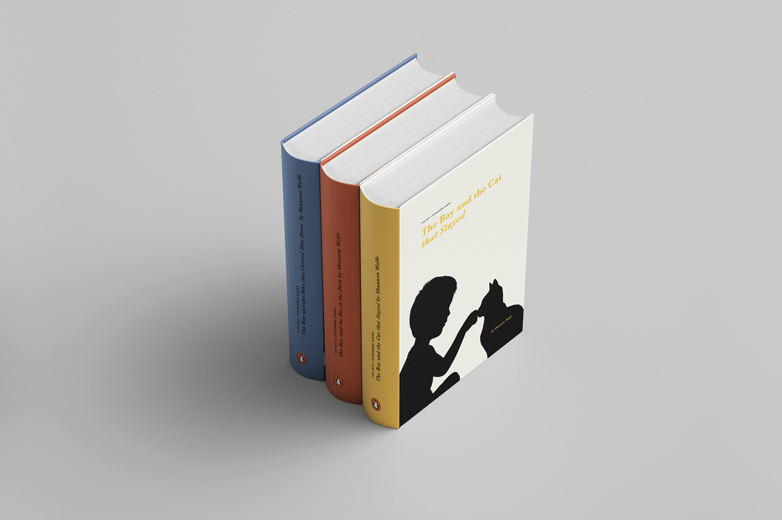
The Boy I Remember Series, Mock up
Project Type: Book Cover Design, Series Branding, Typography
Tools: Adobe Indesign, Adobe Photoshop, Adobe Firefly
Tools: Adobe Indesign, Adobe Photoshop, Adobe Firefly
Background: I came across three short stories about a boy at different stages in his life and was inspired to shape them into a unified book series, The Boy I Remember. Each story explores a different moment in the boy’s life, touching on themes of loss, connection, and resilience.
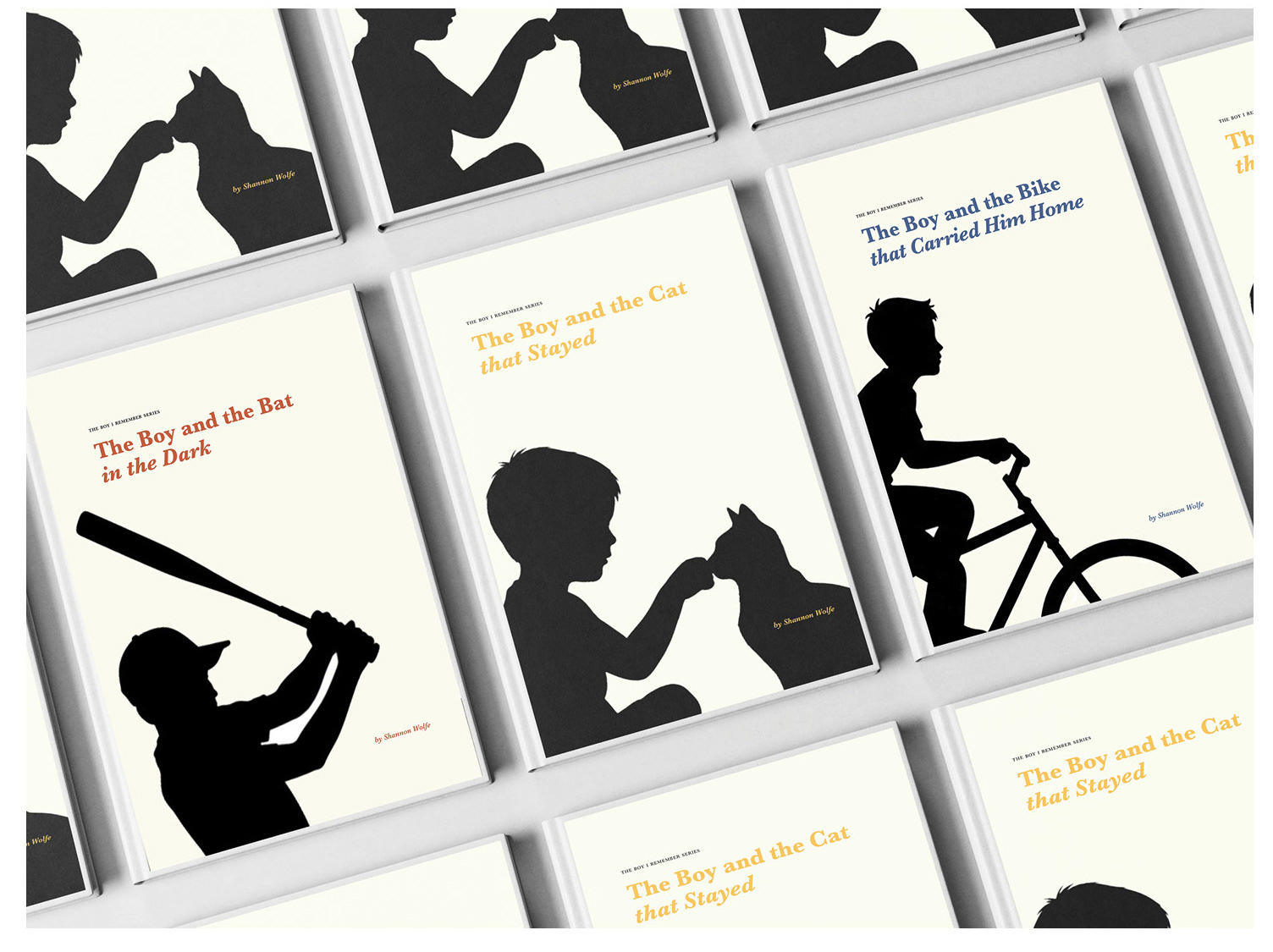
The Boy I Remember Series, Front Covers
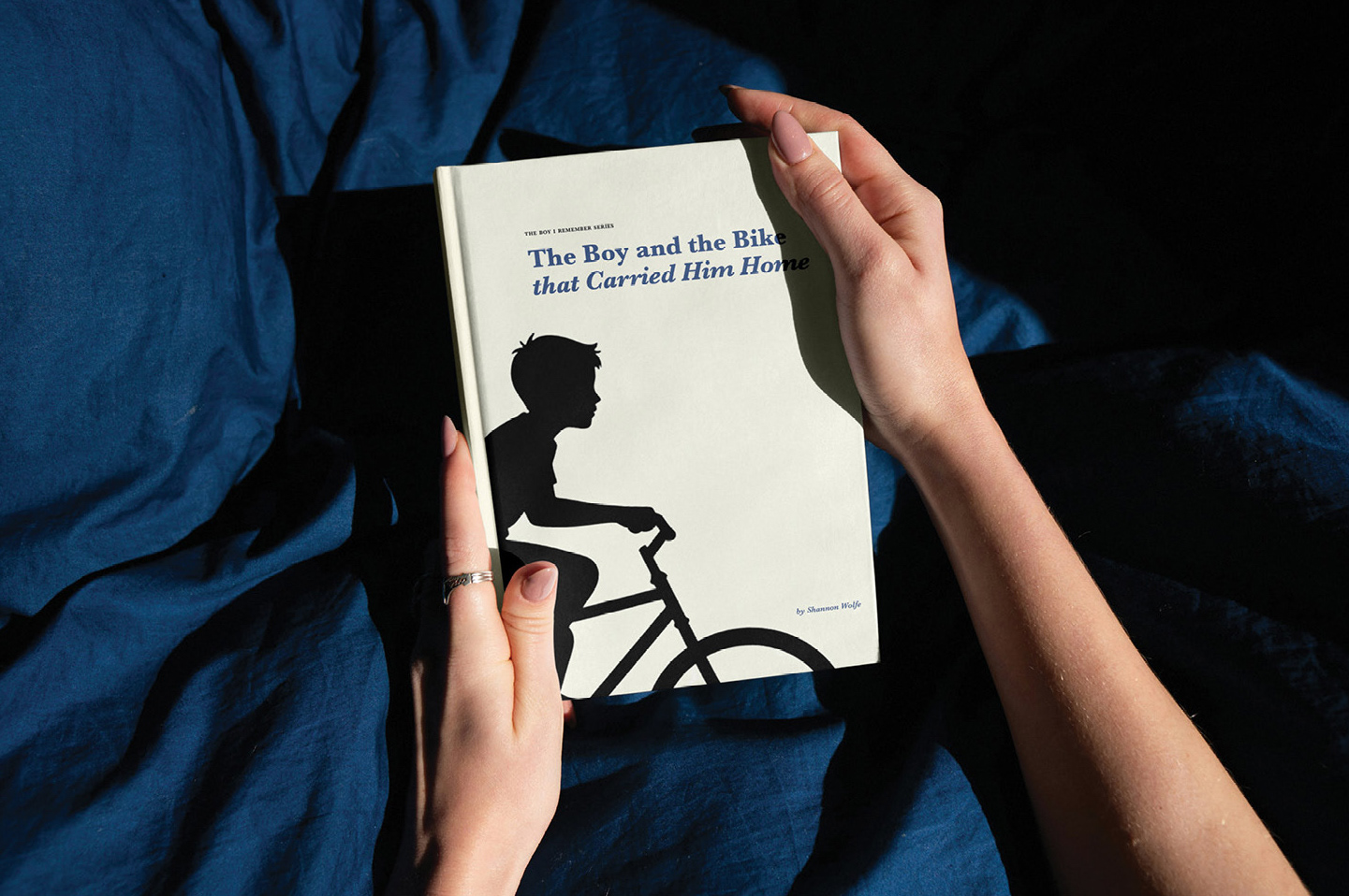
Concept: The first story, The Boy and the Cat That Stayed, focuses on the bond between a boy and the cat who enters his life after his father’s death. The second story, The Boy and the Bat in the Dark, follows a boy determined to become a great baseball player. The third story, The Boy and the Bike That Carried Him Home, follows a boy who gets lost in the woods.
Together, these stories form a series that can be read individually or as a connected whole. Their emotional tone guided my design approach, influencing everything from visual language to pacing, typography, and mood.
Together, these stories form a series that can be read individually or as a connected whole. Their emotional tone guided my design approach, influencing everything from visual language to pacing, typography, and mood.
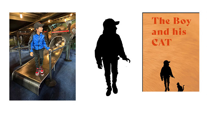
Experiment with Photoshop and Silhouette concept
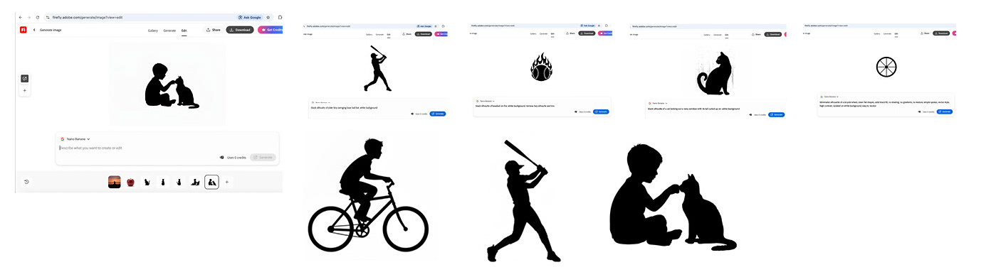
Experiment with prompting Firefly (AI)
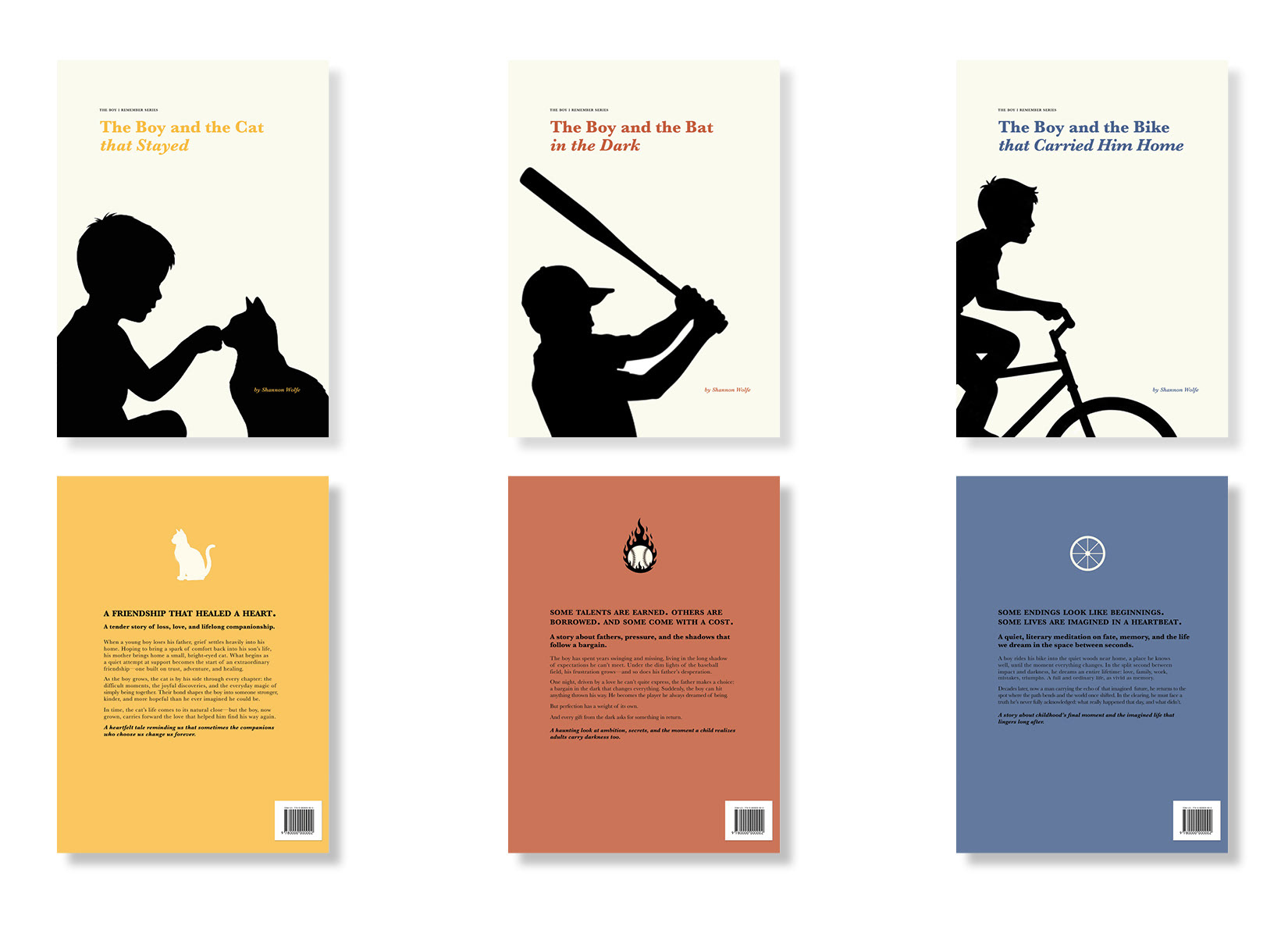
The Boy I Remember Series (Front and Back Covers)
Design Process: The Boy I Remember uses figure-ground relationships for immediate visual clarity. The design balances individuality and cohesion: each book stands on its own with distinct color and imagery, yet the consistent typography, layout, and silhouette style clearly unify the series.
Targets audience are adult readers ages 30-60 who are drawn to literary fiction, nostalgic storytelling, and emotionally resonant narratives.
Targets audience are adult readers ages 30-60 who are drawn to literary fiction, nostalgic storytelling, and emotionally resonant narratives.
The Boy and the Bat in the Dark, held by reader
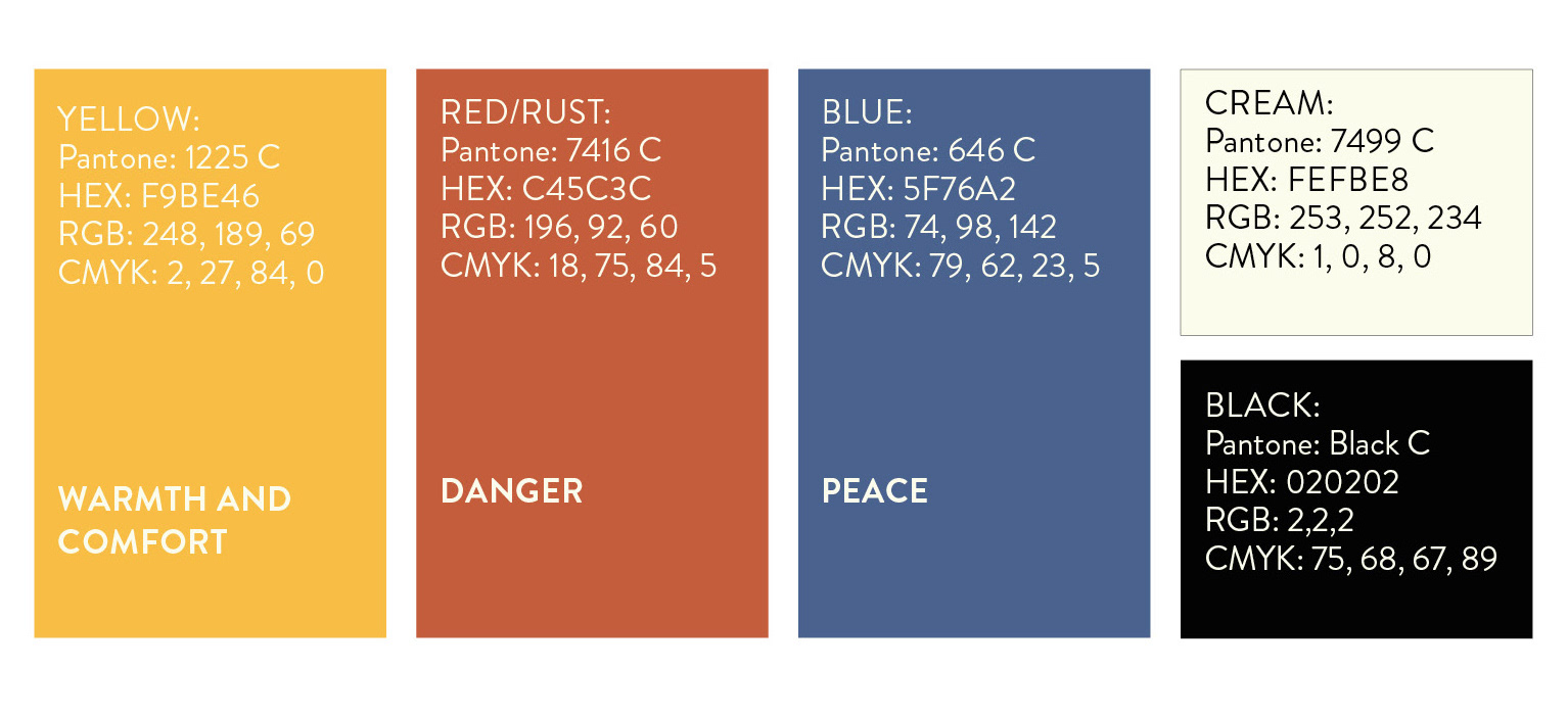
Color Palette

Typography exploration
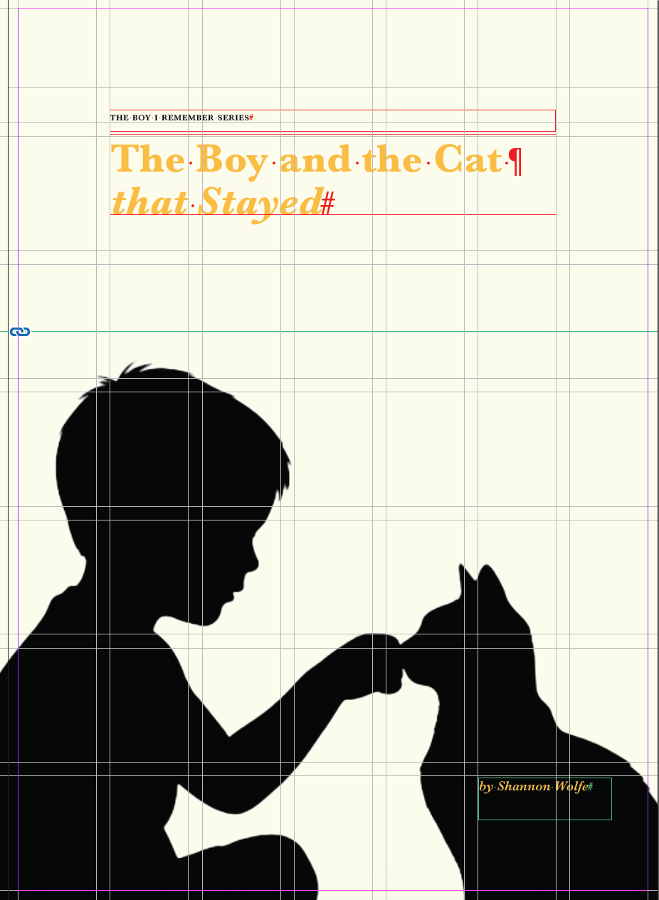
Cover Grid and Layout
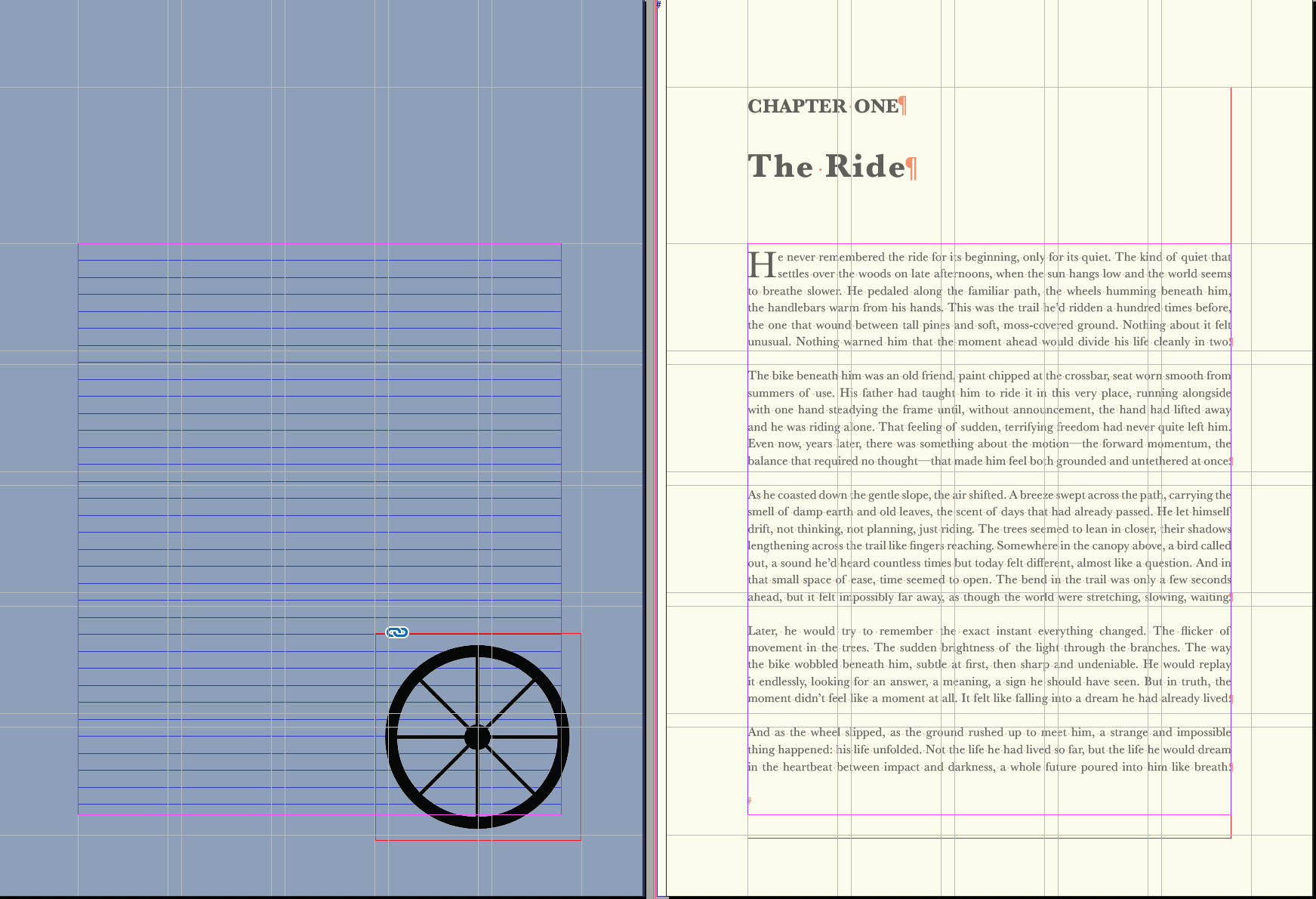
Inside Layout and Grid
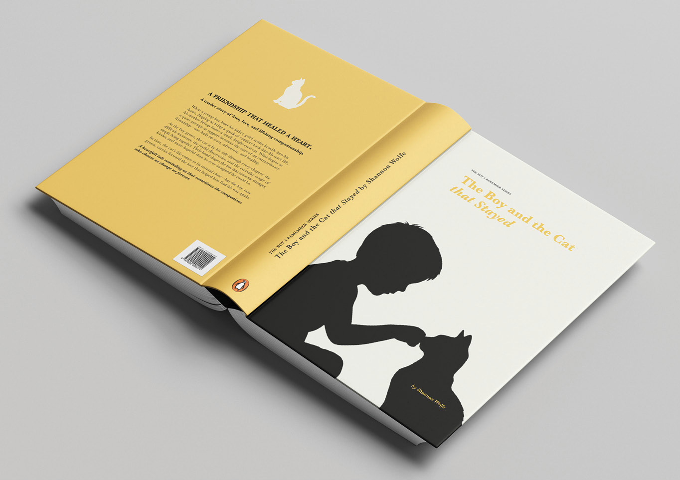
The Boy and the Cat that Stayed, Front, Spine and Back Cover
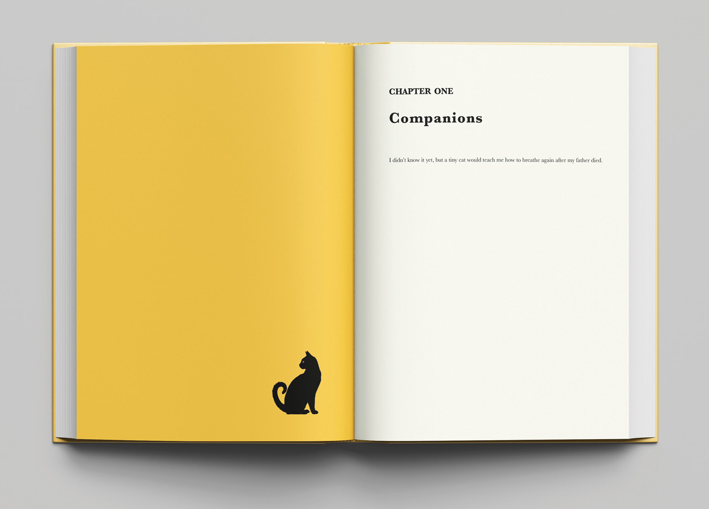
The Boy and the Cat that Stayed, Chapter Opening
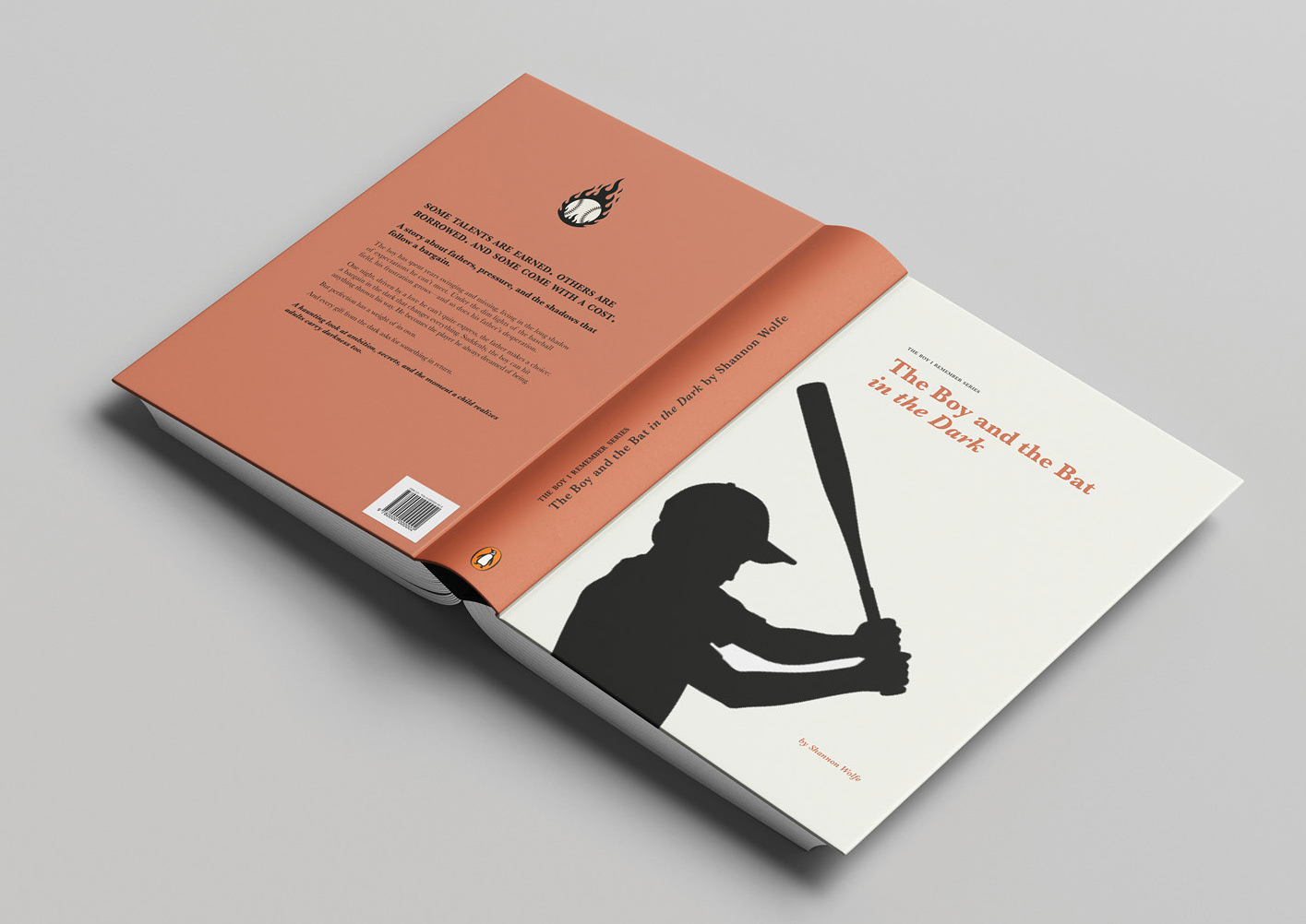
The Boy and the Bat in the Dark, Front, Spine and Back Cover
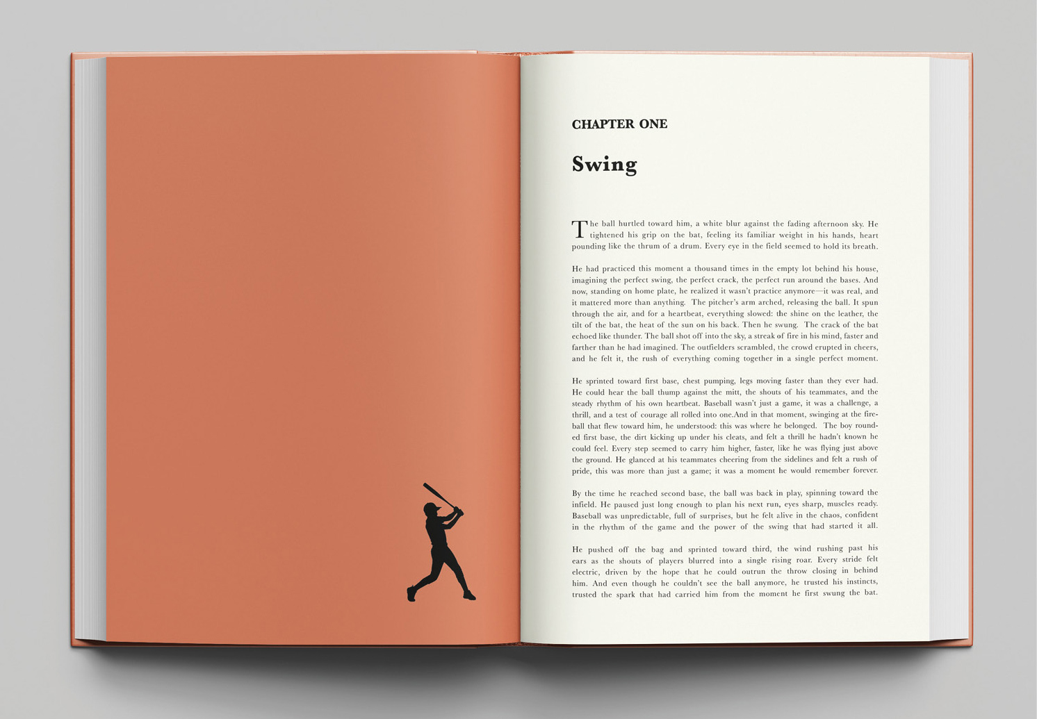
The Boy and the Bat in the Dark, Chapter Opening
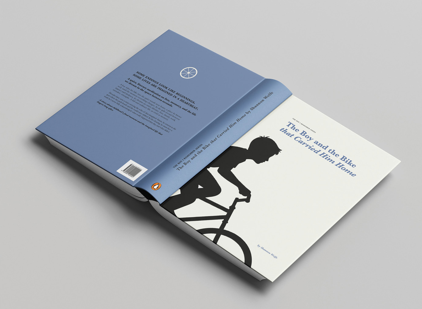
The Boy and the Bike that Carried Him Home, Front, Spine and Back Cover
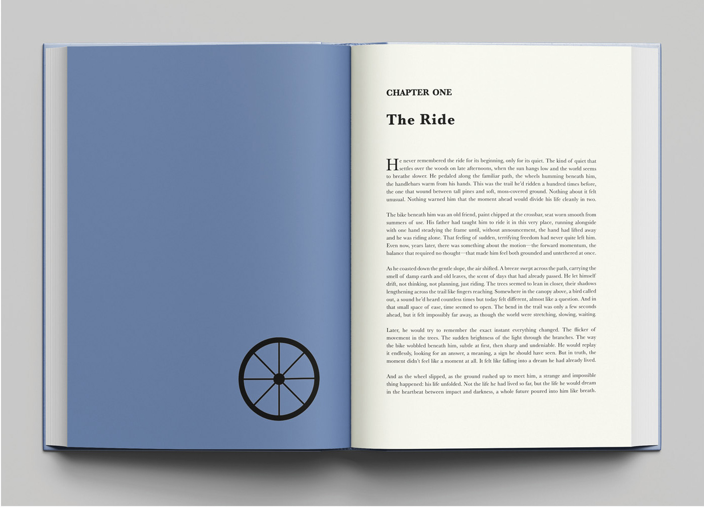
The Boy and the Bike that Carried Him Home, Chapter Opening
Design Solution: The series balances cohesion with individuality through a clear visual system. Consistent elements—Baskerville typography, clean layouts, central boy silhouettes, figure-ground composition, and uniform cover dimensions—tie the books together. At the same time, variable elements like emotion-driven color palettes (yellow, rust red, blue) and action-specific silhouettes give each story its own identity while maintaining a unified style.